We have a new logo! And now comes the difficult part of explaining something completely visual in prose, but I like a good challenge so here goes…
Before I get into the new logo, let’s talk about the old one for a bit. I loved the old logo. Really! But for those that weren’t aware, it featured a light from the outside of our building, along with the phrase, “Light the Future.” The only problem was that well before I started working here in 2018, the light was removed. So for four years, our logo was, at best, a conversation piece.
Getting a new logo was certainly something I wanted to do, but this task was pretty low on my list of priorities. Also, I didn’t know where to begin. Thankfully Assistant Director Liza Taylor took on this project after sharing similar concerns upon her appointment in 2019. Technically all I did was complain about it until she arrived – thanks, Liza!
Things moved fairly slowly on this project until we found an artist – luckily for us, one started working here just last year! Michael Goe, one of our newest employees, is an amazing portrait artist and even had his work displayed in our gallery shortly after he began working for us. We naturally approached him to gauge his interest in this project, and unfortunately while a visual artist, a graphic designer he is not. But his brother is!
Once David (Goe, Michael’s aforementioned brother) was on board, we talked about what we wanted in a logo, why we wanted to change it, provided some information about the library in general and the Village, and in a few weeks he sent us back some designs. Then we gave feedback on everything from the color palette to the font, and eventually we had our very own, board-approved, brand-new logo!
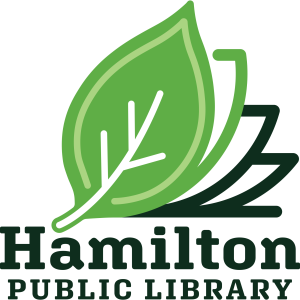
Now, you could just scroll over to our website at hamiltonlibrary.org to see it in all its glory, but since this is published in a newspaper, I’ll do my best to describe it. We went with an elm leaf above an open book, as if the ‘leaves’ of the pages turned into this leaf! Puns! The elm leaf was chosen because of Hamilton’s relationship and focus on trees, be they oaks, maples, elm, or other. As far as why a book was included, well, we’re a library! We stayed with our colors as they exist for the most part. Dark green on the book cover, fading to a lighter green and white on the leaf.
Thank you to the Board of Trustees for supporting this project and offering feedback on designs throughout the process. And thank YOU for reading!
Connect with/complain to Travis Olivera at the Hamilton Public Library by phone at (315) 824-3060 or by email at tolivera@midyork.org, or in person at the library.